Brand Your Blog
If you're new here, you may want to subscribe to my RSS feed. Thanks for visiting Suncoast Scribe!
Recognition is all about branding. When you see those golden arches from way down the highway, you know you are getting close to a McDonald’s restaurant. When you see someone running by with a Swoosh on their shoe, you know they are wearing Nike.
Children learn symbol recognition very early. They do not need to know how to read to know if they are looking at Coke or Pepsi. They just look for the branded symbol.
If you own a small business and do not have a logo that sums up your enterprise, you need to get on the ball. In fact, even a blogger will benefit from branding – the name of your site, a logo, even your colors. You want someone to be able to recognize your business simply by glancing at your logo. You want to find a logo design that is unique, simple, and speaks of what you represent.
I’ve worked as a graphic designer for years. I have worked with businesses to develop logos and full identities. It can be an expensive and time consuming process. That is why I was thrilled when I was asked to look at the LogoYes site, a DYI (do it yourself) logo design company.
I have nothing against people designing their own logos, but all too often I have seen people use low resolution clip art that will not print well when resized and looks unrecognizable if it is not printed in full color? Who has the money to print everything in full color? You need to have a scalable image that looks good even if it is stripped down to black and white.
All of the LogoYes elements are designed to look great no matter how large or small you resize your image. And, they print well in black and white. Plus, the design process is super fast and simple. You just need to choose how you want your logo to feel, as in bold or with flair. Then, you choose a logo, text, font, and colors. You can resize and move elements around on the page. It’s that simple.
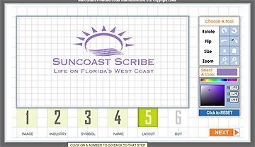
I gave it a try and in about two minutes I had a logo for Suncoast Scribe that looks great.


Hmm, great site, thanks! I actually ran across an article a couple of weeks ago that said just the opposite re:logos. As I remember, their main point was that everything is so yourname.com these days that the visual element isn’t as important. I think they had a point, but… I’ve always been a sucker for something that looks good on a t-shirt.
The whole “yourname.com” thing came about due to John Chow. It is still pretty popular to brand your name in a domain name. As an overall brand, though, it needs to be visual. People remember visually better — well, most people do.